Art. That is what we are creating for you and your clients. A piece that they will be excited to hang in their home; that single image that will showcase the magic of their wedding or portrait sessions.
First and foremost this image needs to show off your client(s), the actual subject of the image. And then you blow them away with something that takes the initial image to the level of fine art. This could be the astonishing architecture of a grand cathedral or a huge beautiful sky that takes you to another place. But either way the environment is there to frame your subject with bold drama.
So how do we get there?
Well, there isn’t a specific set of criteria for a Signature Edit that fits in a neat little box. We tried… it broke out like a crazed animal. But we do have a few guidelines for what we look for in the perfect Signature Edit to get you close to a definition.
- Get the client out in the open. This is pretty simple. A Signature Edit is about your client(s). Don’t hide them behind bushes and rock walls. This is their moment of glory and we want to see them in it, all of them.
- Go for that big shot. The magic in the added drama is often in the environment surrounding the subject.
- Frame them with the environment. Use everything at your disposal from the leading lines of pillars or trees to the natural frames of grand entrances or even stone archways. Good composition is imperative.
- Pay attention to what is cutting into your subject or what happens to be sticking out of them. Ha, that sounds morbid but it is crazy how many submissions we get with horizon lines cutting off the heads of your clients or even hard edges of buildings cutting them in half.
First impressions are everything. All of the bullet points above lead us here. The images submitted for Signature Edits need to have an initial wow factor before they ever get to our editing process.
In future installments we will cover different settings for Signature Edits. However, we wanted to kick off this series of posts with an indoor shot. It’s not always easy to get the kind of grand shot that we are looking for in an indoor setting.
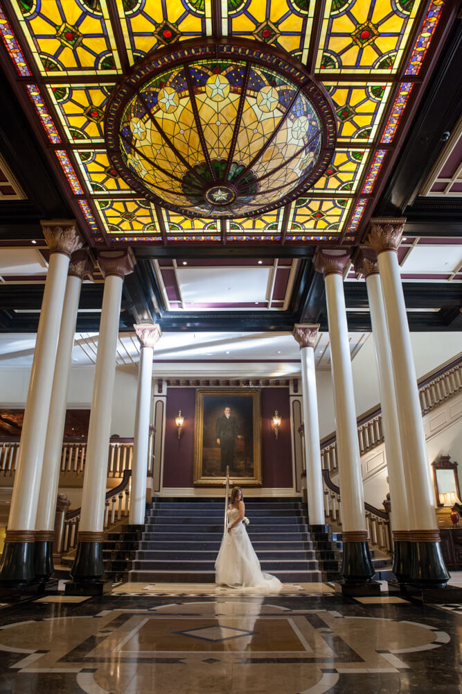
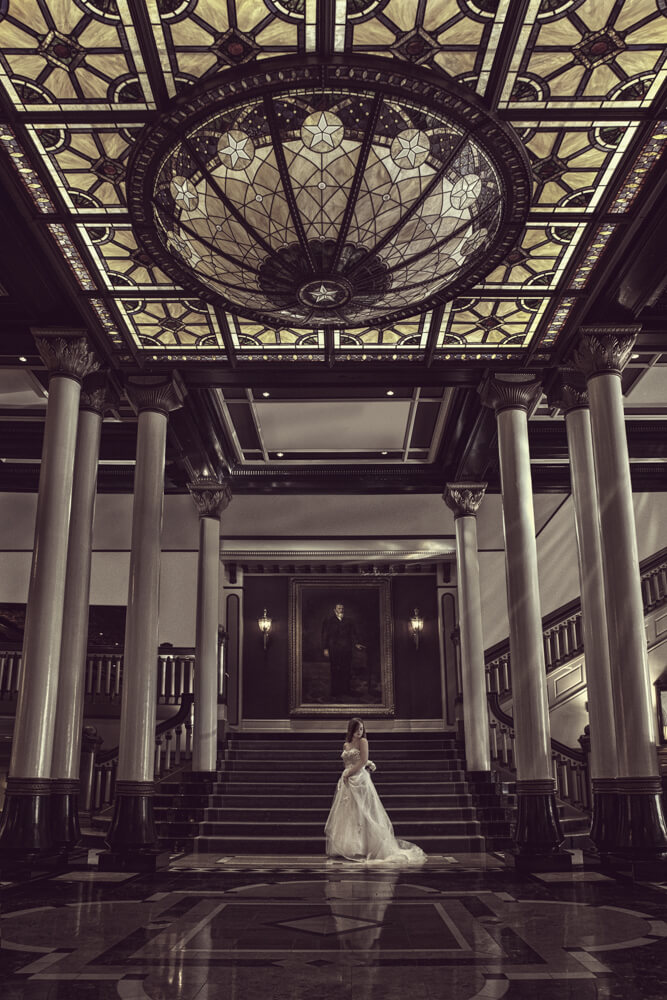
This gorgeous bride and elegant room were photographed by Rafael Serrano Photography. We loved the big shot that was captured here. The pillars, the railing, the stairs and the perspective of the lines on the floor and ceiling all lead your eyes to the bride. The railing in the middle of the stairs is an issue but can be removed with relative ease. As an indoor image there will be no sky swap and the lights in the image are already on. So if there is no sky swap and there is no cool lighting tricks to perform then what do you see in this image for it to qualify as a Signature Edit?
Our Vision
When you look at an image where do your eyes go? If they don’t immediately go to the subject then we have a problem. In this case we have several areas battling for your attention. We need to shut them down and get you visually to where you are meant to look: the bride. In order to do that we need to get rid of the hotspots on the ceiling and pillars. The stained glass lighting feature on the ceiling is beautiful but bright, saturated and commands a lot of attention. The painting between the lights is a bit of an issue. All of the leading lines that work for the client are even better suited to get your eye up to the painting so it really needs to be darker to get back down the stairs to the bride. The subject is a little dark and needs a little pop to draw the attention that she deserves. Lastly, we need to get the foreground centered up and fix the slight outward bow of the pillars.
All of these things were able to be completed within the reasonable scope of a Signature Edit allowing us to add value to the initial image, and turn a good initial photograph into a piece of fine art.
— Payton Hediger


