Creative Editing: Getting the most out of Leading Lines with Payton Hediger
Leading lines are an important aspect of any image. They give flow, create movement and even give us direction as to where to look. Straight, hard lines are usually what we think of first such as horizon lines, the hard lines that make up archways and door frames or maybe even the railings of a walking bridge that lead right to the subject. But not all lines in an image are obvious. There are soft lines that are created in cloudscapes, water or rolling hills. There are even invisible (implied) lines. These lines are a bit trickier because they are often created from the eyes of the subject. The direction the subject is looking can often create these implied lines that lead the viewer around the image or right out of the frame. Identifying which lines are helping to draw the viewer to the subject and which lines may become distractions will make or break the image. In wedding photography, this can be especially difficult to implement with the fast pace of the event. However, take the time with the creative artistic edits as these will be your portfolio and leading sales images.
Leading lines flow to and from your subject and giving the visual effect of pointing the viewer toward the subject. Generally speaking, leading lines are more effective when they are symmetrical. Think of placing the subject in the middle of a path with the subject centered in the image. The sides of the path serve as the leading lines pointing towards the subject. However, leading lines do not always have to be straight hard lines. Soft natural lines of clouds, water or hills can often become leading lines as well.
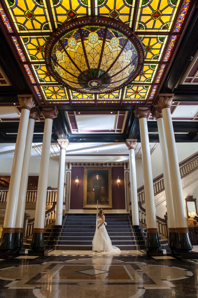
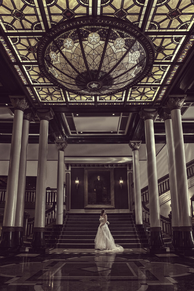
There are also invisible leading lines that are created from implied direction. Most prominently these are created by the direction the subjects are looking in the image. Between two subjects these lines can help reinforce a connection between them. But if a couple is looking in opposite directions, positioned slightly up or down, you can create some amazing implied leading lines. See images 26a & 26b below as examples.
Vertical and horizontal lines are not necessarily leading lines. These lines do set the building blocks for your composition though. Following traditional composition rules such as the rule of thirds will dramatically strengthen the image. However, if these lines are placed in the wrong location they can easily become distracting elements.
Horizon lines are especially guilty of becoming a problem in an image. Photographing someone of the same height as the shooter often puts the horizon line right through the head of the subject. But this is not limited to just horizon lines. Any line that cuts through the head, neck or joints can easily become a distracting issue. The head is especially important because it is a focal point. So even if the viewer gets to the focal point they are driven away by the line(s) cutting through it. Lines through joints can often create optical illusions that the adjoining limb has been separated.
Lines do not always have to point to the subject to assist the subject. In many cases simply framing the subject in an entryway or window can help keep the viewer stay focused on the subject of the image. However, pairing framing elements with leading lines and a strong composition with horizontal and vertical lines will truly separate a strong photograph from a simple snapshot.
Below are a few images from one of our long-time clients, award winning Portrait and Wedding Photographer: Megan McCormick, owner of McCormick Photography. We have worked with her for many years and as you will see in the images below, her work has grown through the years to truly take full advantage of what lines can do for her imagery. Throughout these images, we’ll see examples of how lines that make up the imagery can both enhance and detract from the subjects in the following Signature Edits from Evolve.
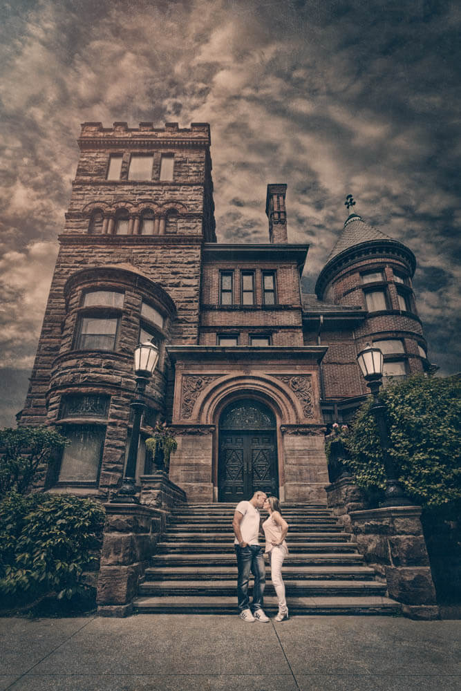
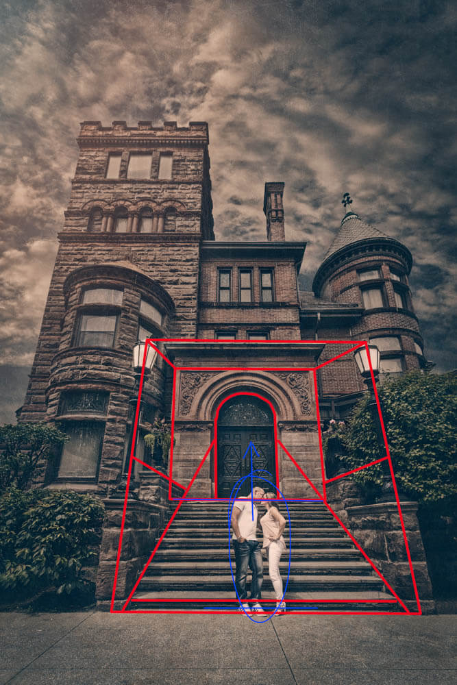
Here we have a wonderful image of an engaged couple in front of a gorgeous estate. This particular image, as well as the other examples that follow, have all been processed through our Signature Edit service. Through our Signature Edit process, we are able to make lighting and exposure adjustments, skew adjustments and we can even replace the sky to help add drama among other things. But what becomes difficult to overcome through any kind of post production processing is fixing perspective. Had the shooter taken about two steps back and a step to the right the over all building would have made it in the frame roughly the same as it is now. However, the symmetry of the entryway would have been perfectly aligned. While most may not immediately recognize the difference in spacing between the lamp posts and the grand entrance, they become areas of tension to the trained eye. Even if the view doesn’t recognize this immediately, the areas between the lamps and the entrance will still become a distraction point that pulls the viewer’s attention away from the subjects. The other issue in this image is the placement of the couple. Had they been positioned a few steps up the hard lines of the tops and bottoms of the steps would not be cutting through their heads and ankles, respectively. Instead, the doorway would have framed the couple and the hard edge of the steps would have been appropriately placed mid-torso. These subtle faults in the image create a battle between the first and secondary subjects. Just as easily the secondary subject that is the house could have been used to showcase the primary subjects had they been slightly repositioned. As you can see in the markup below many of the leading lines point to the middle of the doorway. By framing the couple with the doorway the viewer would have been lead directly to them and the frame would have kept the viewer focused. Yes, the overall image is beautiful and we certainly want to view it as a whole, but we also need to quickly be able to identify the point of the image.
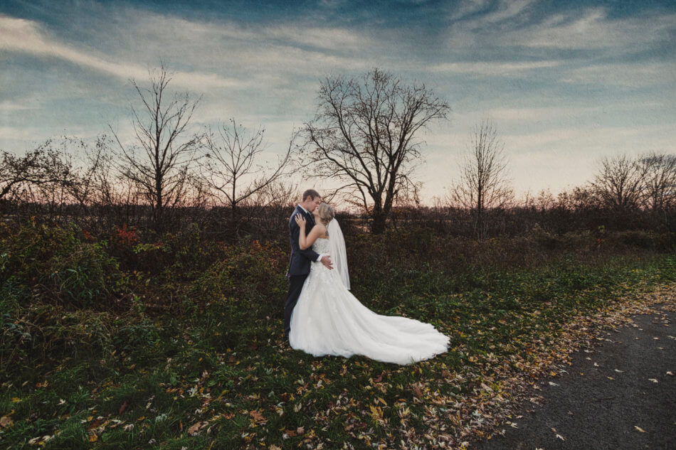
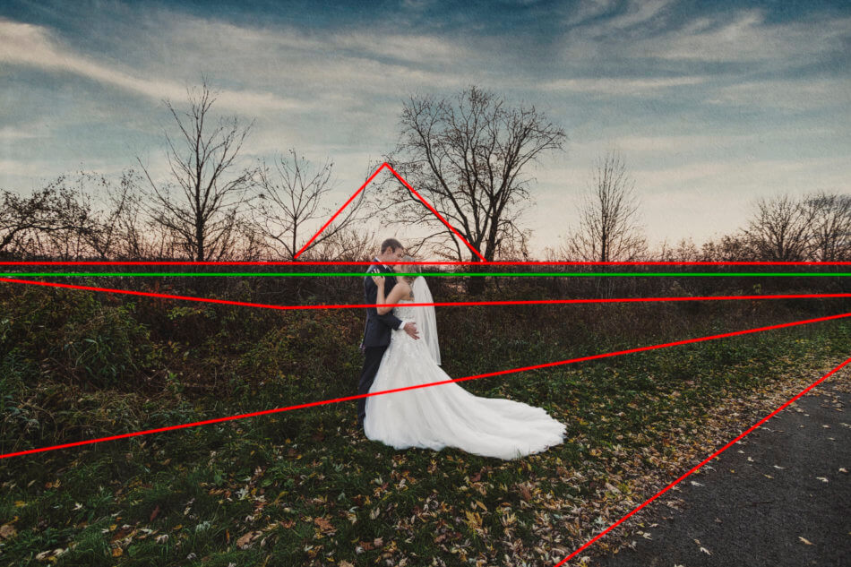
This is another example of lines that can become distracting. Both the horizon line as well as the top of the tree line in the background have been placed in such a manner as to cut through the heads and necks of the wedding couple in this image. Simply dropping down to one knee would have pushed the couple above the horizon line to have it intersect at a more appropriate placement, just below the shoulders to mid-torso. In addition, moving the horizon line down a bit and cropping our some of the foreground, would have placed the horizon line on the bottom third line. There is actually a perfect triangle created by the branches behind the couple that would have framed them nicely as well. However, these aren’t the only distracting lines in this image. As you can see in the markup below, lines in the brush, grass, and asphalt create leading lines that push the viewer out of the right side of the image. The line created from the transition between the grass and the asphalt create the biggest issue. Segmenting off the asphalt into a distracting negative space. This can be helped by the shooter moving over to the left place the couple in the right third. Paired with moving the horizon line down to the bottom third, the composition of this image becomes much stronger.
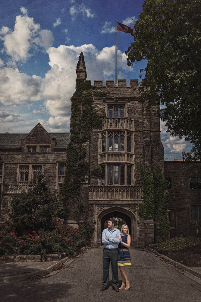
This is a great example of how a few key lines paired with the subjects posing can really draw the viewer to the subjects. This is a strong image with a cute couple and a really poignant secondary element. The building in the background is very intricate and demands attention. However, the placement of the couple in this engagement image couldn’t be better. The curb on either side of them create some great leading lines to the subject which are then framed by the archway of the building. Just using the secondary element to showcase the subjects helps to draw attentions away from the secondary element, redistributing the attention back to the couple. This is because the building serves a purpose, to frame the couple. It is then a tool of the image rather than becoming a subject. In addition, they are facing away from each other looking slightly upward. This creates two nearly symmetrical leading lines to the couple that pairs nicely with the leading lines of the curbs.

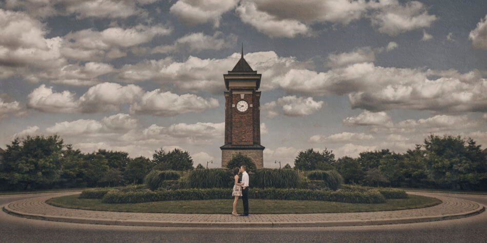
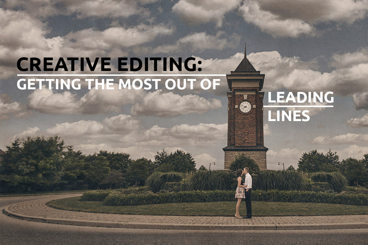
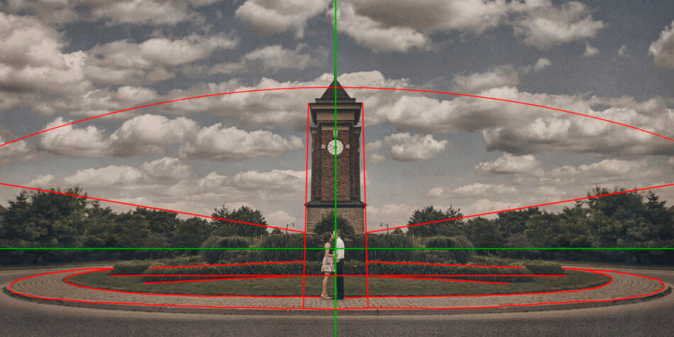
This is a spectacular image that represents everything we have covering in this article. You’ll notice in the markup image below just how well all the lines work together in the image to frame and draw the viewer to the subject. The horizon line and vertical line created from the clock tower intersect perfectly at the chests of the engaged couple. The bush just above the couple frames them nicely breaking them away from the secondary element and showcasing them nicely. All the lines of the bushes and the trees in the background point right to the couple. Even the clouds create a soft arcing line to help keep the viewer in the bottom portion of the frame. Lastly, the sidewalk helps to keep the viewer from straying too far to the bottom of the frame and because the sidewalk isn’t cut off at the edges of the frame; the viewer can follow the sidewalk around the frame and still be lead right back to the subjects. There is only one minor point of contention with any of the lines of this image. If the couple had been moved a step closer to the shooter, placed in the center of the sidewalk, the far sidewalk line would not intersect at their ankles.
There are many kinds of lines that make up an image; hard, soft and implied lines. There are lines that build structure for the composition and there are lines that provide direction for the viewer. However, lines are not the pure and simple answer to create a “beautiful” image. Instead, think of these lines as tools to showcase your subject matter. Let them provide structure, flow and focus in your image. In other words, lines should provide the foundation for your composition and instruction for how to view the image.

